
 A digital health company
Our scope
AdventSys contributed UI/UX design and front-end work while the client retained ownership of the platform, data pipeline and clinical logic. The engagement focused on making complex monitoring data usable for the people who act on it.
The design problem
Remote monitoring produces data at different cadences from wearables, patient-entered measures and assessments. The clinician interface therefore centered on one practical question: which patient needs attention today?
- Risk-first clinician view with red, orange and green classification.
- Trend detail available when a clinician needs to investigate.
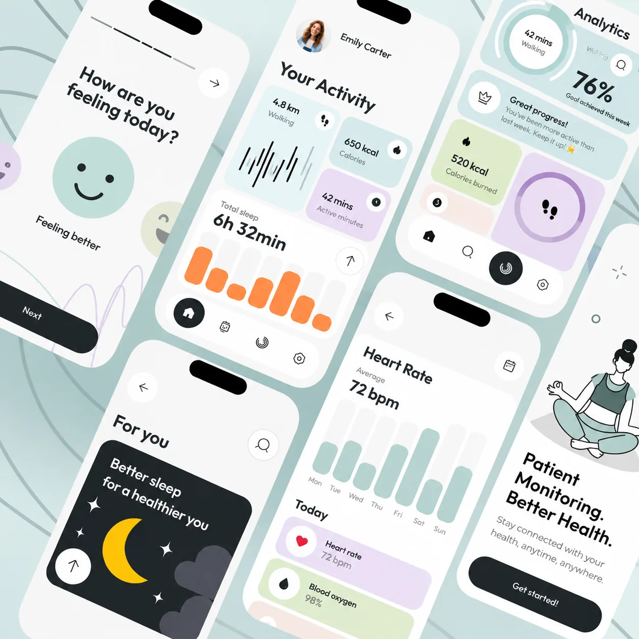
- Patient experience centered on clear actions, health status and wearable-sync visibility.
- Different information hierarchy for clinicians and patients using the same underlying platform data.
Data-aware interface design
Because the product handles health information, interface decisions also need to respect role visibility, session behavior, screenshots, logging and other data-handling constraints defined by the platform owner. The case study states only AdventSys' interface contribution and does not claim platform-level healthcare compliance certification.
Designing for attention, not just data volume
Remote monitoring can generate many readings and status changes, so the interface has to help users recognise what needs review without making every signal look equally urgent. Information hierarchy, trend context and clear status language allow the front end to surface exceptions while keeping the underlying detail available when a user needs to investigate further.
Keeping the front end aligned with changing data
Wearable and self-reported information can arrive at different times and with different levels of completeness. The interface therefore needs predictable states for loading, missing information, delayed updates and partial histories. Designing those states deliberately reduces ambiguity and makes the experience more resilient when the data pipeline does not behave like a static demo dataset.